Peoplesafe App
Peoplesafe protects 400,000+ lone and high-risk workers across 25+ countries. One press of a SOS button connects them to Peoplesafe’s own Alarm Receiving Centre, which can escalate straight to the police, faster than calling emergency services directly.
The app did its job, but it hadn’t kept up. Flows were inconsistent, the interface looked dated, and neither inspired confidence and led to low usage rates. For a safety product, that’s a real problem: if people don’t trust the app or can’t use it quickly, they won’t rely on it when it counts.
More people were relying on it every year, as customers moved from dedicated alarm devices to the app. I led the redesign: rebuilding the core flows, making the app accessible across all users and devices, and designing for people who might be stressed, on the move, or in serious danger.
- Role
- iOS Designer
- Timeline
- Currently in development
Problems
The app worked. Using it didn’t feel safe.
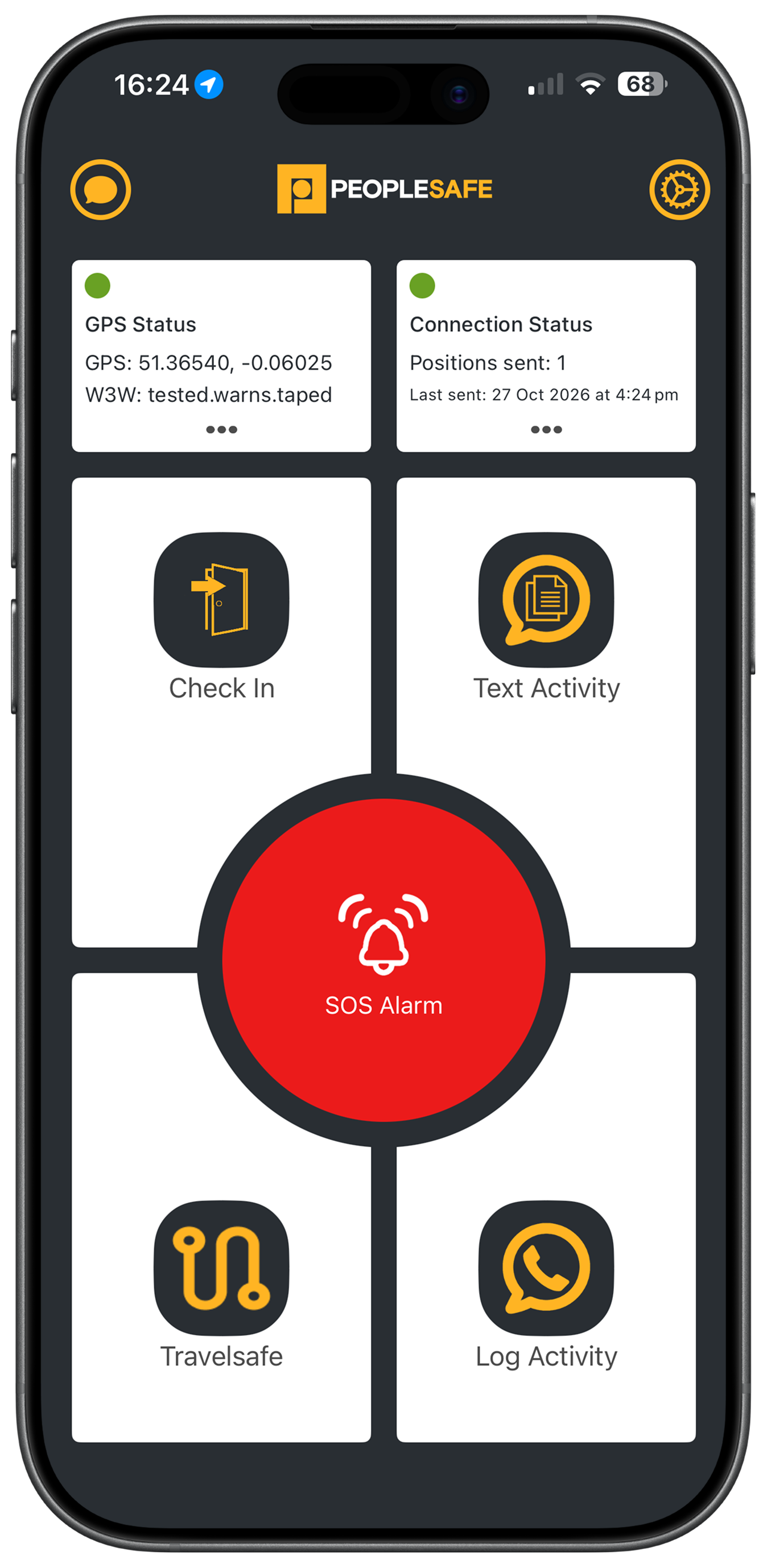
Hard to find, hard to follow
Only four features were visible from the homescreen; the rest sat two taps deep in Settings, and users reported they couldn’t find them. Each feature also used its own components and spacing, so nothing felt dependable.
Too many false alarms
Fall detection and the discreet alarm (shake to activate) could stay on all the time. Phones dropped in bags and pockets raised alarms nobody meant to send and this would cause unnecessary stress on the Peoplesafe Alarm Receiving Centre.
People felt watched
Users assumed the app tracked them constantly, which made them hesitant to use it at all causing low usage rates.
Not built for everyone
Low-contrast text, small tap targets, and no Dynamic Type or VoiceOver support.
Apple Workshop
We kicked off the redesign through Apple’s design feedback programme: a workshop at their Battersea offices, followed by 12 weeks of fortnightly sessions with one of their UX designers.

In the workshop, we mapped every problem with the existing app, from information architecture and platform patterns to visual design and accessibility, and sketched out possible solutions.
The sessions that followed were where the real work happened. We iterated on the new designs, pressure-tested them against Apple’s Human Interface Guidelines, and worked through technical questions as they came up.
Design Process
Our guiding principle was simple: make Peoplesafe feel like part of iOS. I designed iOS-first, with Android to follow on the same foundations.
People spend their days in other apps, so the patterns they already know are the ones they’ll reach for under pressure. Native components, Apple’s Human Interface Guidelines, and nothing that makes someone stop and think.
That meant restraint. If an element didn’t help someone stay safe, it went. Every screen does one job, clearly.
Jakob’s Law, if you want the textbook name for it.
Decisions
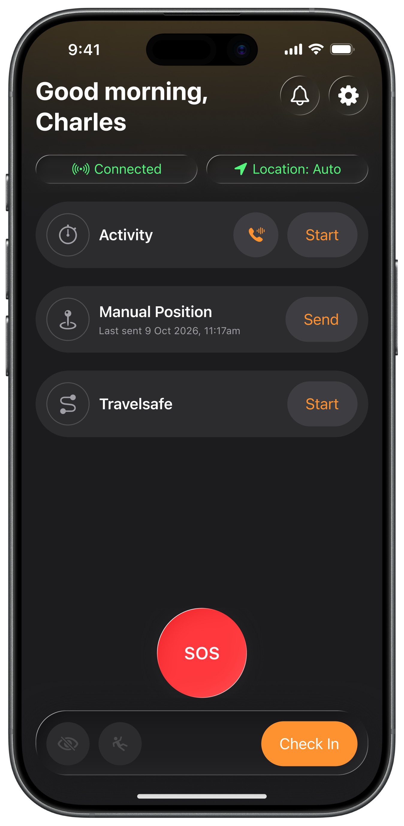
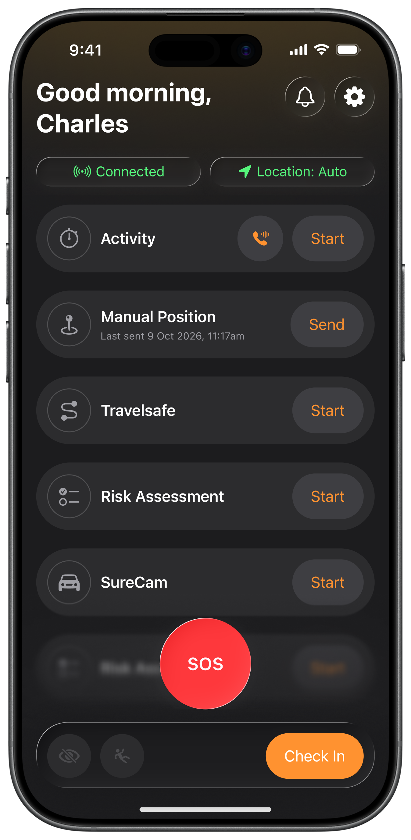
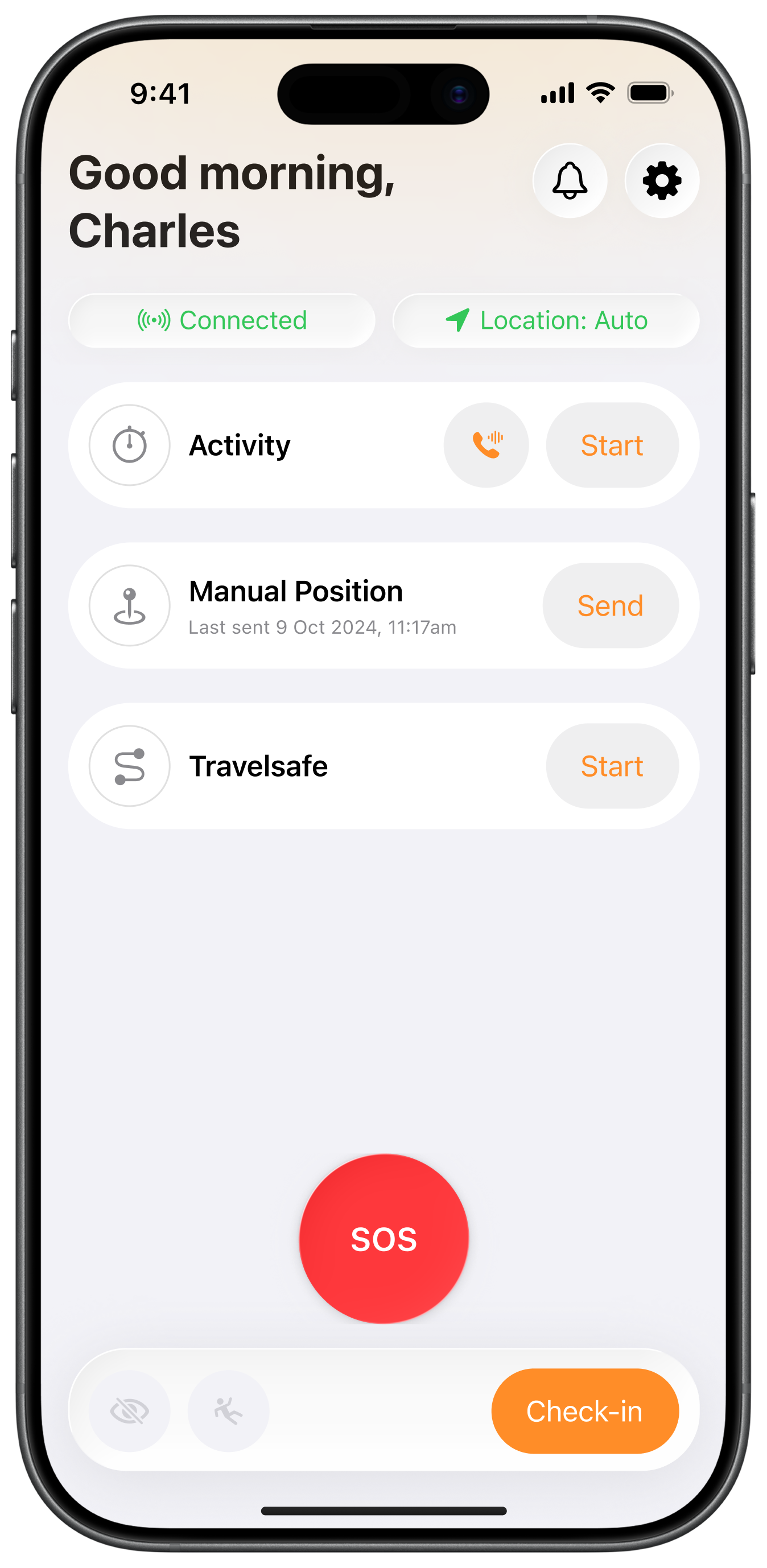
A list, not a grid
Some customers use two features, others use ten. The old grid only had room for four, so anyone with more found the rest buried in Settings.
A list removes the ceiling. Every feature now lives on the home screen, and if there are more than fit, you scroll, the same movement people use all day in Mail, Photos and Contacts. People can also reorder the list, so the features they use most sit at the top. A list also scales with Apple Dynamic Type and leaves room for whatever Peoplesafe builds next.
Protection that’s on when it matters
Fall detection caused more false alarms than anything else. People switched it on, forgot about it, and alarms fired long after their shift had ended.
So we tied it to the working day. Fall detection and the discreet alarm can only be switched on once someone checks in, and both turn off automatically when they check out.
It adds one tap at the start of a shift. In return, protection is on while people are working and off when they’re not, cutting our most common type of false alarm at the source.
Status you can read at a glance
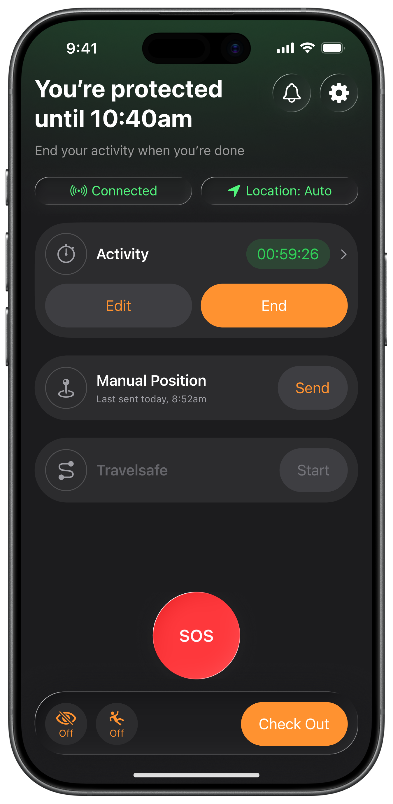
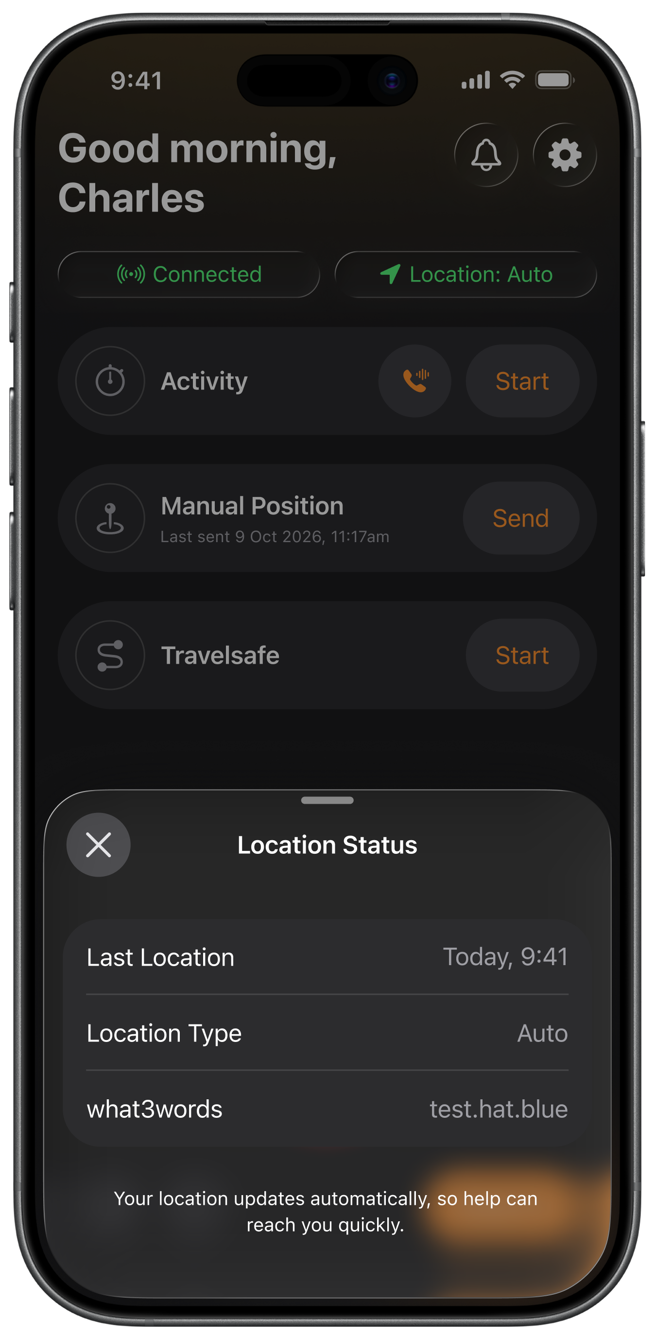
The old home screen opened with GPS coordinates, a what3words address and a count of positions sent. Accurate, but it’s system data, not something a worker needs.
We replaced it with two plain-language pills that answer the only questions that matter: is the app working, and is my location being shared? The detail is still one tap away, for anyone who wants the reassurance.
Tracked only when it counts
Some users felt watched, so they now choose. Auto shares location continuously. Manual only sends it when they choose to. Every status pairs colour with an icon and a label, so it reads clearly for colour-blind users too.
Safety still comes first. Raise an SOS, trigger fall detection or start an activity, and location switches to automatic, whatever the setting.
A home screen that tells you where you stand
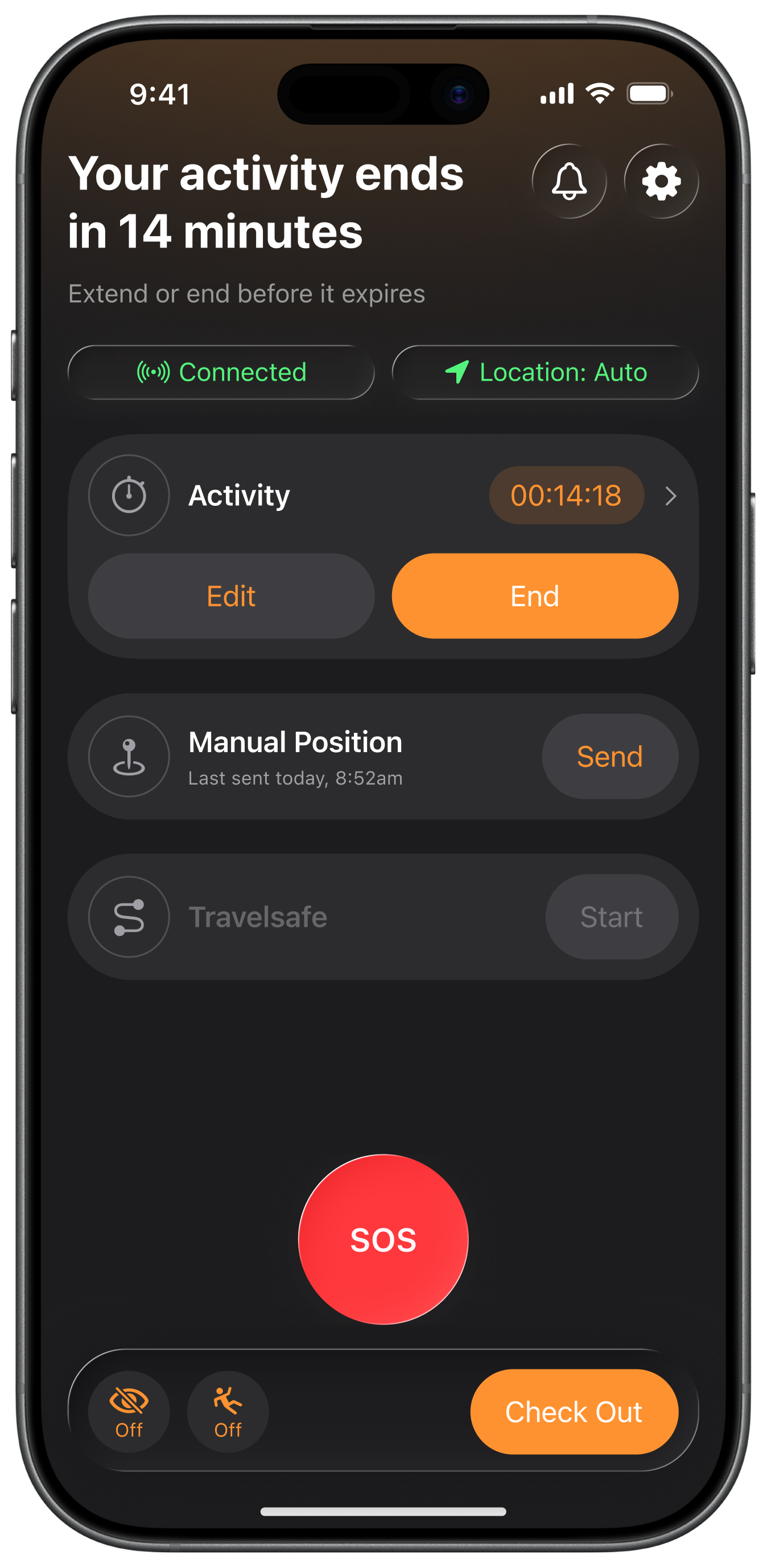
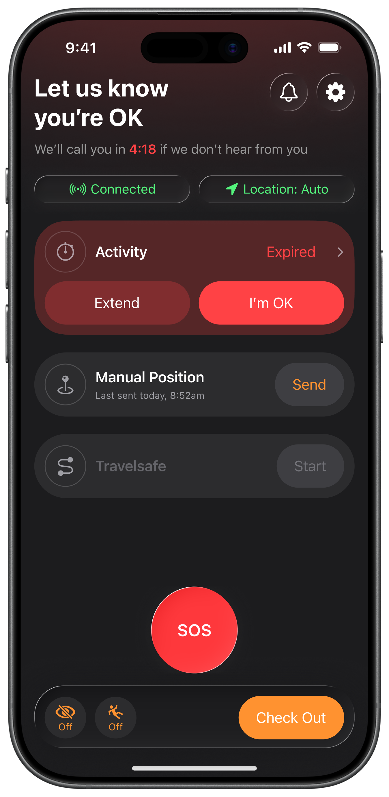
The headline and colour now change with what’s happening. Green means you’re protected. Amber means your activity is ending soon. Red means it’s expired and we need to hear from you.
The headline says what to do next, and the colour tells you how urgent it is before you’ve read a word. When the activity expires, the actions you need (Extend or I’m OK) move to the top, with a countdown to when the Alarm Receiving Centre will call.
Live Activity
The old app had no working Live Activity: it barely used them, and what it had was unreliable. Now it does. While an activity runs, its timer sits in the Dynamic Island, so a worker can see how long they’re covered for without opening the app. They can extend or end it from there too.
Native by default
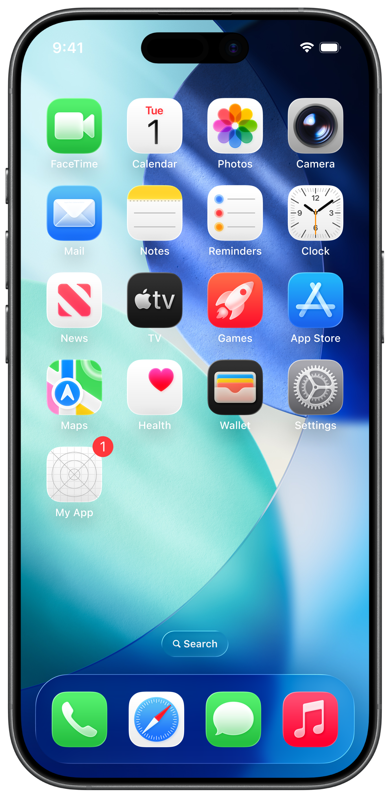
I built from Apple’s iOS 26 library in Figma, and engineering built it in SwiftUI with the same native components. SF Pro, system colours, system icons, standard states.
That one decision fixed the inconsistency at the root: every flow now shares the same parts, because they’re Apple’s. It also brought light and dark mode for the first time, following whatever the phone is set to.
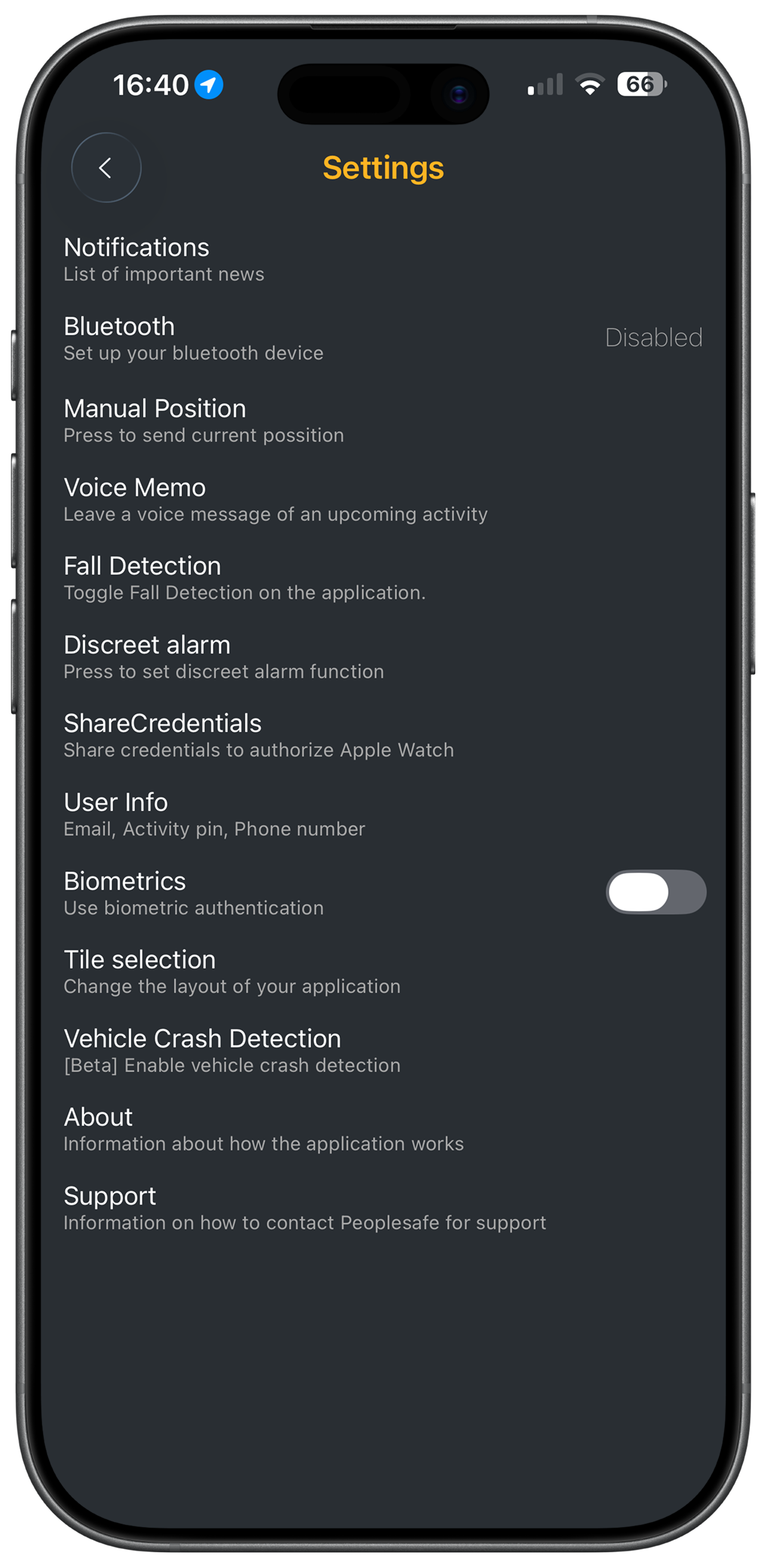
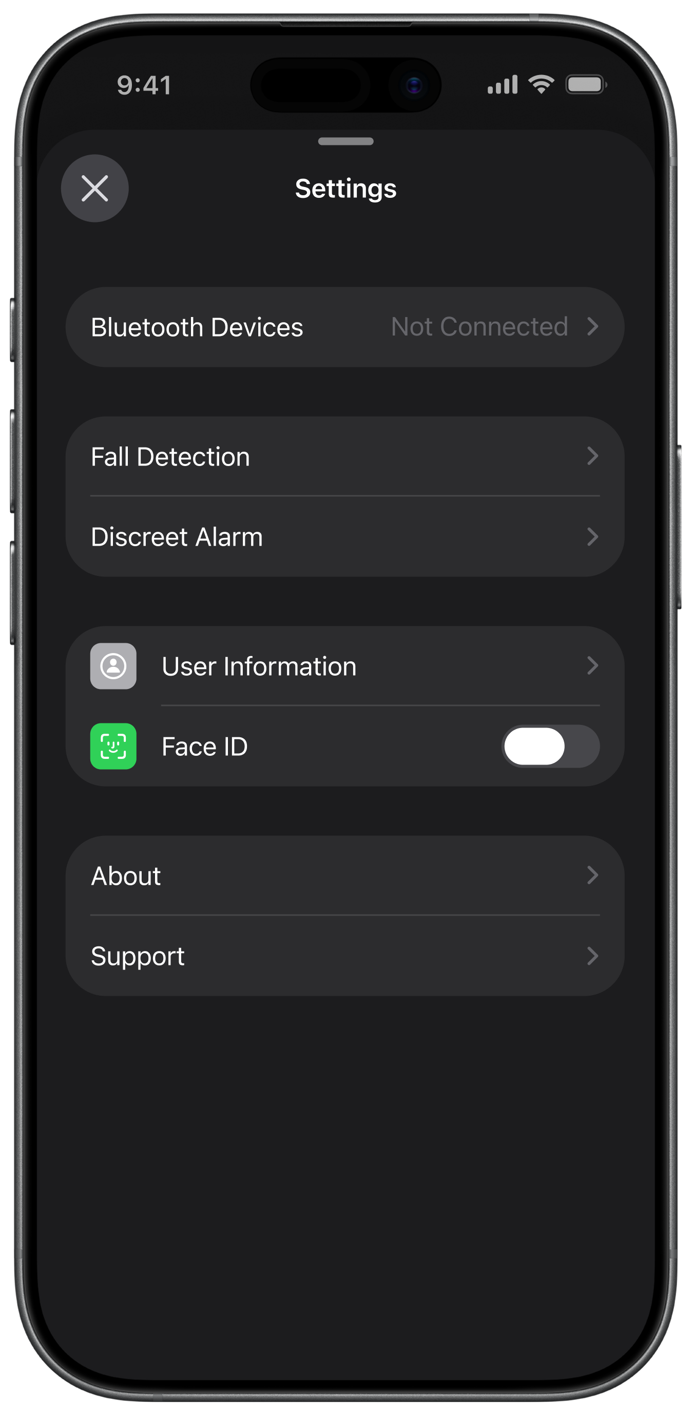
The settings screen shows the difference. It’s now a simple sheet of native iOS rows, compared with the old settings menu.
Gallery
Travelsafe
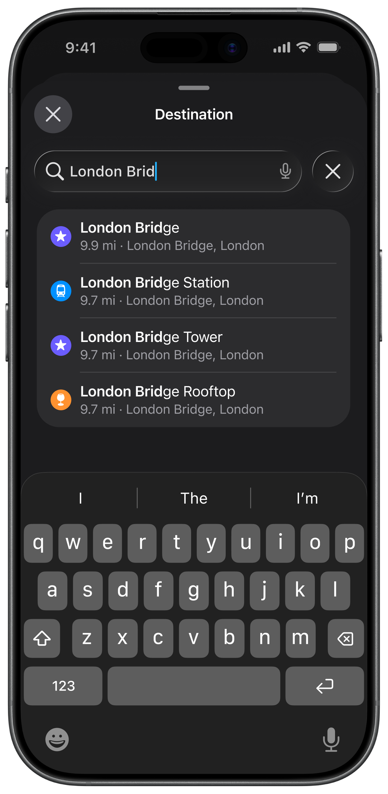
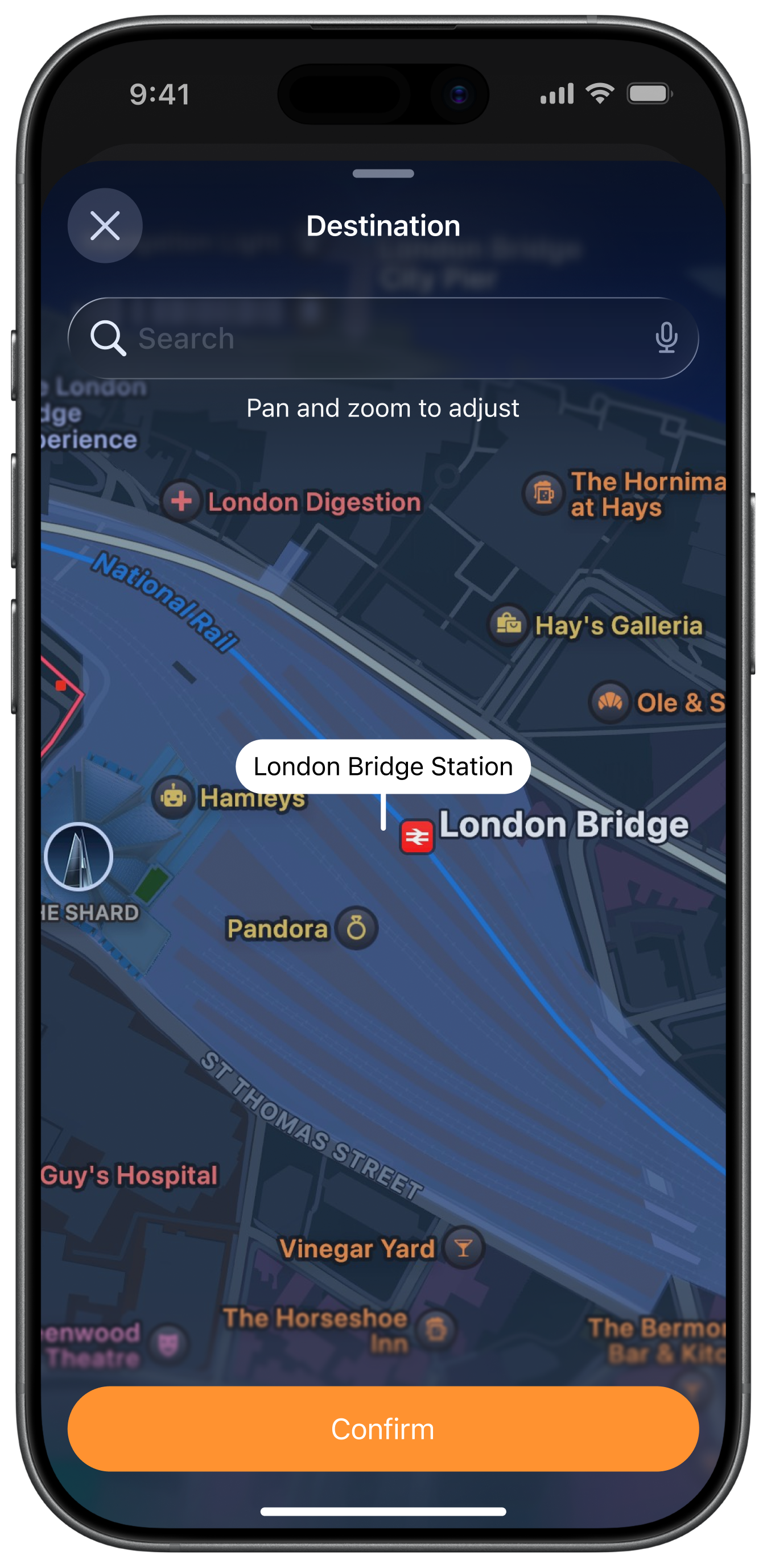
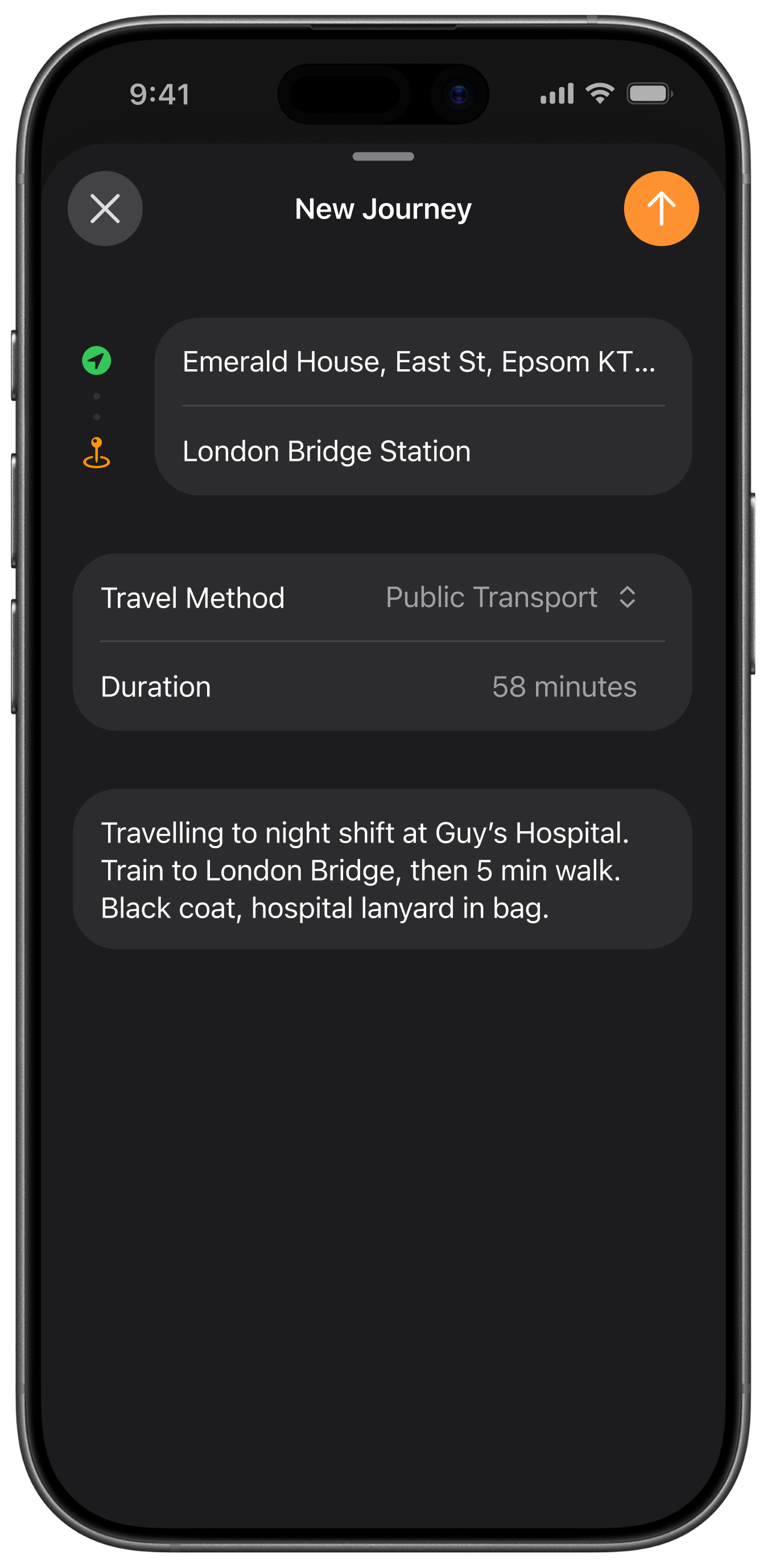
Starting a journey follows a pattern people already know: search for a destination, confirm it on the map, then check the details before you go.