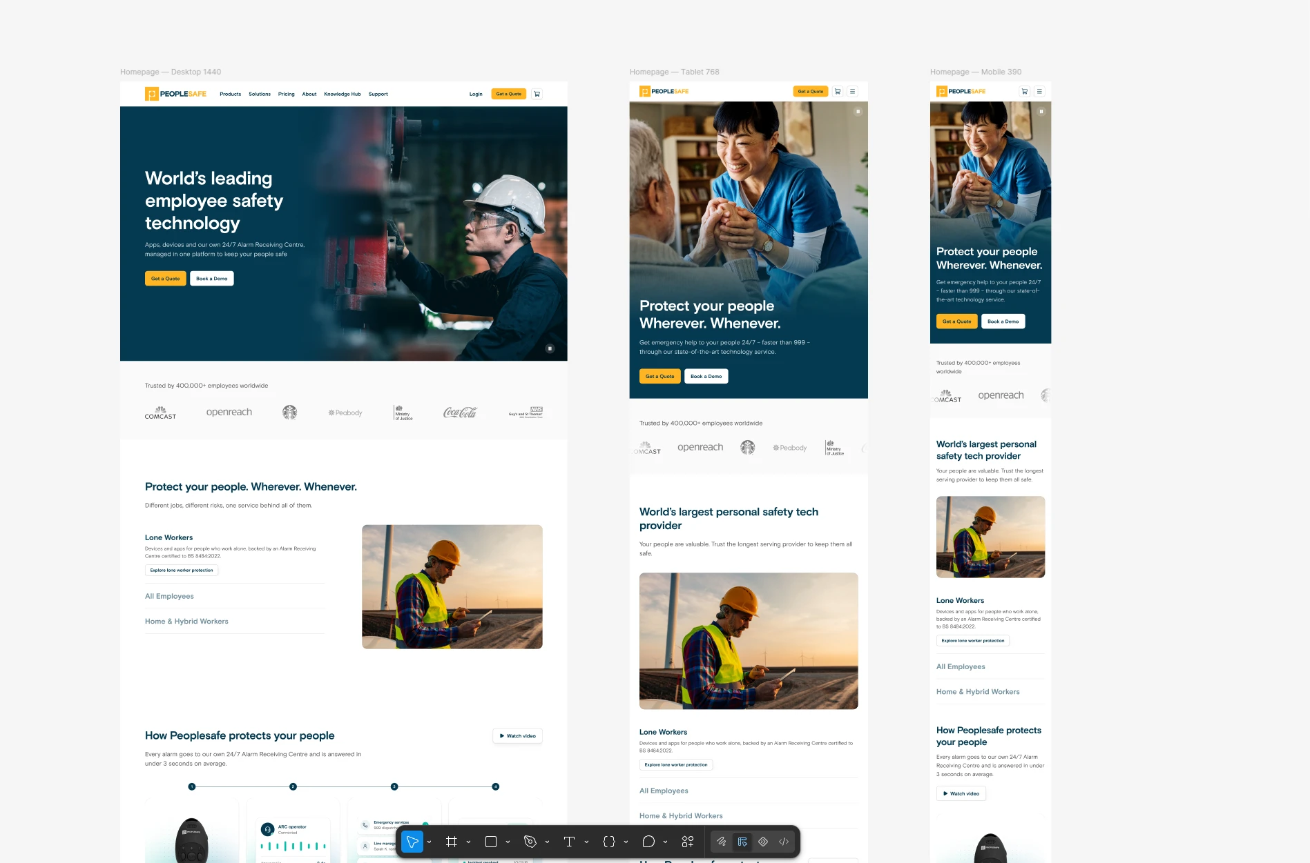
Peoplesafe Website
For a buyer in a new market, the website is the first meeting with Peoplesafe, and the old one was built for the UK. As the site moves from peoplesafe.co.uk to peoplesafe.com, I audited it, designed its replacement in Figma, and built a live prototype in code that the agency is now building from.
- Role
- Lead Designer
- Timeline
- Currently in development
Why now
Peoplesafe is expanding worldwide, where buyers don’t know the brand yet. They’ll judge the company by its website before they speak to anyone, and the old site looked like a mid-sized UK business, not the global leader behind the service. Moving to a .com domain was the first signal that Peoplesafe had outgrown the UK, and the new site needed to back it up.
Problems
No design system
At least five button styles, seven corner radii and four unrelated card styles, plus two CTA yellows and three near-blacks. Every page made its own decisions, so the site never felt like one product, and it was hard to trust.
Not built for mobile
Pages scrolled sideways, and the chatbot covered the main call to action. Buttons changed size from page to page, which made the site harder to use on mobile and many buyers will meet it there first.
The biggest advantage was invisible
Every alarm goes to Peoplesafe’s own 24/7 Alarm Receiving Centre, and that is what sets it apart. The old site reduced it to a paragraph and a long video. A visitor should know who Peoplesafe is and what it does within seconds, and the old site didn’t manage that.
Design Process
Before opening Figma, I scored the site across twelve areas against leading technology sites and competitors. Six came out red and six amber. None were green. The audit became a phased plan: quick fixes, then foundations, then a full rebuild.
I designed at desktop, tablet and mobile in Figma, then built a live prototype with Claude Code. I handed the agency something they can open, inspect and test, so they build to the real behaviour instead of interpreting static frames.